 Look at how Picasso plays with shape, tone and line here - he is CREATING -having fun - finding the fundimentals of the form - the ones that speak -the ones that tell the story.
 This is red chalk - or terracotta pencil on a cream paper ( hard to know about the paper) by Boucher - notice how 'open' it is for all it's 'realism' it has economy and intelligence of line that come about through observation and practice. Things have to simply have the right dimensions here, the right shape, and no fussyness of tone, just clarity in the areas - mostly simple crosshatching and lines running the same way as the forms to block in the main areas . NB the different line weights - crucial stuff.
 This is a Picasso head - notice how there is no line around the hair, its a few open marks that suggest motion and direction. The eyes, nose, lips, ears are clean and clear, everything else, like the tie and the hair has a different kind of mark. notice how spaces are left like where the left lower cheek doesn't meet up with anything - things like this lets light work subliminally - same for the hair.
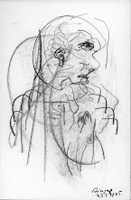
Here's Escher, using all the instruments he can muster, rullers, dividers, elipse guides, etc etc -There are somethings that you need instruments for - if you want to draw a straight line - use a ruler. And for all the mix up of dimensional space - in each dimension the constancy of light in producing consistent highlights and shadows rule.
I'VE ADDED TO WHAT I WROTE IN THE EMAIL - just general thoughts.
I'VE ADDED TO WHAT I WROTE IN THE EMAIL - just general thoughts.
Shadows, surface, texture - it's all the constancy of light Ange.
Light reveals all: When there's too much of it, it flares and obliterates shape and detail just like darkness. The 'object' exists within this tension of light and dark. (I only just thought of that last sentence as an explanation - of sorts - and I like it!) The object of the drawing lessons you're putting y’rself through, although about aspects of observation; it's the hand eye co-ordination it helps to build that you really need.
In the end, it’s an easy and loose control of materials while you do the thinking unthinking thing. The thinking unthinking is also control and accident. Control is also about using a ruler to draw a straight line if the object requires it, it’s common sense - or at least draw feint ones as guidelines, the same for circles and elipses – I used to use a lot of plastic elipses and circle templates when I was illustrating. This is all about making things look ‘real’ – if you’re drawing a glass bottle f’rinstance, the lines must be straight and the ellipses must be at the correct observed angle – then the eye says wow, that looks real. It takes all that kind of stuff – the shortcut tricks to get the object to look as if it is ‘real’. A drawing of a wonky bottle is a drawing of a wonky bottle – do you see what I mean?
It's a lot like the basics of music - playing a bit of piano or guitar - if you practice three chords - say G, C, D. and listen to how they interact, their particular intervals of tones - and practice moving between them with different rhythms and learn two of the relative minors that go with them - Aminor, Bminor - all Western Music harmony is there in their relationships. ( Like observing an object to see where the light is coming from and where the strong lines and shadows are – the chord also has ground rules – it has to be in tune.)
Nearly every song you've ever heard is built on the way these couple of minors and majors interact - and certainly all (western) choral and pop music. It's the three chord trick of Jazz and blues – it’s three part harmony.Think of three tones of grey pencil, which is all you need to render - a light, a mid, a dark. These combine to make the actual substance of the 'object' you're drawing. When they are right – like your dark ball – they become ‘it’ the thing – rather than the scribbly nearly versions. They look like this because of the hesitancy of trying to get it right – trying to get the tone variations to fade into each other etc. they simply look like scribbled marks on the paper. The thing itself is in the balances of tone as light or darkness reveals its shape/ bulk- the highlights reveal texture and the shadows, or darker planes of the object help reveal the bulk or density of the form. Glass is the same - it's simply more complicated because light is reflecting everywichway, combined with its transparency – it needs a lot of quiet observation – just looking to see what is happening – but it pays off. You can read all this stuff – and anything else you find in a book – but it isn’t understood until you go thru the drawing exercises over and over again. Concentrate on one effect at a time – say, like how to I make something shiny? You’ll see examples in your books – usually that effect is about a degree of contrast of light and dark – because hard materials reflect hard and clean edges. You just have to chase it until you get it right – you know if you get it right –because it looks right.
To render well and to a high standard of realism you need yr hand and eye and your control of materials working together to make marks that mimic the constancy of light - that's what all the various techniques like crosshatching, drawing small circles, continuous shading are about - qualities of consistency – use rulers, French curves, anything to help achieve this.Light travels outward meeting the edge of an object, and onward until it meets another plane - If you draw a cube - or a circle and mark a dot as a light source anywhere above it, draw a line where the light source hits any cube edge and carry it on to the 'ground' - that's the length of the shadow - because light moves in straight lines -( unless its bent by a missive star or black hole of course - lol) and it's always - always reflecting - and carrying with it colour information from one surface to another ( local colour) - in drawing, this is tone, and density of tone. Outside, the sky reflects in just about everything (an aspect of local color ) Keep on doing the drawing exercises, any drawing exercises, you'll get better. Remember tho - that the kind of highly rendered drawing - say that A,C. on the painters site is doing is the constancy/consistency thing ( She's good) - it's a different mindset, and only time and careful application – lots of it – allows that kind of illustrative artist to work realism or a reasonable facsimile of it in time enough to earn money. It’s no good being ace if it takes you so long to do it that the client can’t afford you. You learn lots of tricks and any shortcuts you can.
For many - or probably most people, camera realism is the main signifier of 'skill' and that's fine, it holds much of the perceived worth of the history of art - it's a different kind of needful thing – it’s about getting the work finished so it looks ‘correct’ and nobody is able to say otherwise.
What are you going to do when you are trying to draw highly emotive things, personal things, things where there are no ‘objects’ no things in reality to compare them to. Some can do it, most can’t, many won’t or will give it up because they can’t stand the fact that other people won’t ‘understand’ it thinking that they ‘can’t draw’.
If you have something to prove – it can be a long road waiting until someone or everyone, finally agrees, ‘Gosh that looks just like a Photograph’ !!! Duh! lol.
Don’t see the point myself – you may as well take a photograph.
Best not to have anything to prove – what y’do is what y’do – just keep practicing slowly and everything will improve a few months down the line.
Rendering so that there is some kind of strong 'realism' is completely about a constancy and consistency of mark and feel - and like a lot of other good illustrative drawers, and coloured pencil workers on that site - they spend a lot of careful time practicing – and looking - because that is the only route to it ( unless your a natural drawing savant.)So keep practicing, you say you would like to render – draw – ‘better’ simply keep on practicing and seeing how you can make tone work, like you found with the ball – the darker version is a more complete ‘thing’ it sits on the paper, becomes more than the paper - and the eye says yea that’s right.
Keep doing the other H.W. drawings along side your observations and exercises and you can have a bit of both worlds – which is what I think you’d like.
Three tones of pencil. Light Mid Dark. From the H's to the 5B's - each a tonal world that can interact with each other - use the ones that satisfy. The same with your coloured pencils. Three tones of yellow, red blue, orange violet etc.
This lil rule of three tones might help you.
By using such rules what we are doing is finding ways of cutting down on the chaos - of controlling it, of centering in on its essentials - of recognizing basic visual things like the constancy of light - and dark is the absence of light - shadows come under that rule too – shadows are graduations toward light – or graduations toward darkness – the brighter the light the darker and clearer the shadow – but shadows have their parts too – the umbra and penumbra, the umbra being the full shadow and the penumbra being a softer shadow around it.. You can find stuff about this on the web.
Make your own rules too if you want to, as another exercise or keep a small paper folder of A5 drawings that are all about one kind of rule (write it on the folder front) and another folder about another kind of rule.
Rules could be anything you choose:-
Eg. ‘All lines, marks, will move and be made in the same direction as the light’ ‘Everytime I make a mark here, I will make a similar mark elsewhere on the paper’ These become are your own variations of reality – because you dare to
Reality impinges itself upon our consciousness willy nilly – there are aspects of it you can change in art if y want and see how it looks – just because you can.
Painting outside or anywhere, you can make some of your own rules - and impose them on 'reality' as it imposes itself upon you - we did it all the time painting in the black mountains - we'd go out one day and say - 'ok –today - wherever we paint the sky - it will never be at the top of the painting.
‘All shadows will be light instead of dark’
It’s ‘stuff’ to do – to try - about whatever one perceives the nature of reality to be – it plays around with us – so that means we can play around with it. You need to be grounded and aware of what you’re doing with this kind of stuff – because you need to remember that you’re playing.
4 comments:
Well Ange - All that rambling and stuff ( I hope there were a couple of things of interest in it) goes to say - When you're into it, you're H.W. personal drawings are mostly fine - they have their own flavour and feel and you can work at giving them more of whatever you want - only you can do these. When you're doing the exercises - you are very much the beginer - and just need to keep on at it.
What an amazing teaching session! So helpful, so full of insight - as always. Where do I begin to reply....
Examples
Picasso's drawings - basic forms - hmmmm yes, very very nice. It's interesting how body shapes of animals (and people) show mood, not only when in movement, but also when they are still. It's interesting that you can tell whether something is about to move or not, or whether it has just moved. Yes, I see he has picked out the fundamentals of the form.
(When I was little and went to Chapel, I used to sit and imagine the people in the congregation naked, but not just to imagine their flesh, but also their bone shapes - the way they sat - their faces...)
Boucher
This is particularly helpful. I looked carefully at the shading and see that what I finally realised is right - that the shading, like the shadows is only a darker version of the lines/shapes that are already there.
Yes, I see the difference in line weights.
Picasso Head
Yes, what a delight. What impresses me particularly is that PP left open spaces - he didn't rub out previous lines (or doesn't appear to have done).
Escher
Used to look at Escher drawings long ago - ah, old memories...
There are 2 important things I am hearing you say here:
1)I can use a ruler (or anything else) if it makes life easier/ gets a better result - than without it.
2) Constancy of light rules highlights and shadows.
-------------
Yes, me too, I love your turn of phrase 'The object exists within the tension of light and dark'. It was interesting to contemplate the fact that too much light obscures just as much as too much dark.
I've looked at my drawings again and see that most of my straight lines are not straight. I've already ruled lines over some of those in the drawing of the stool, and also changed the shadows. It looks a bit better now - won't spend too much time on it though.
Yes - you write 'you can read all this stuff - and anything else you read in a book - but it isn't understood till you go thru the drawing exercises over and over again.' Yes, yes, yes.
Thanks for the practical advice re dot for light source and then drawing the line from it to object to ground.
You're right that most people consider artistic skill to equate with drawing skill which produces a realistic result. You're right, too, that this is not my final aim. Like you, I think you might as well have a good photograph.
My final aim is to create pictures that mean something, that are alive. What I believe though is that I need to be able to do the realistic stuff in order to learn more about lines, shapes, light - and more importantly about the objects and people themselves - so that I can produce better paintings.
I also find that I learn something when I draw. I like drawing people, for instance, and when I drew Phyllis, my mother's niece - I found that changing the lines on her face only slightly gave me my mother instead. And yet, I'd never consciously noticed that they were alike.
I know I'm a beginner in this area and I'm so grateful for your teaching.
You tell me I shouldn't have anything to prove. My first reaction was that I don't, but then I realised that I do - I have something to prove to myself. I'm determined to work as hard as I can at this. I need to improve so that my paintings improve.
I don't give a toss about what other people think of my pictures since there are a few people who can see them and like them. And these people are the most important to me so that will do. I would still have to carry on even if nobody liked what I was doing - but I get great pleasure (or is it relief?) from drawing/ painting. And at last I have at least the evenings (and part of the nights) to draw in. (I'm aiming to extend this into the daytimes as soon as I can.)
-------
And yes, Dai - I do remember that I'm playing (lol and smile)
----------
Thanks so much for all this - am going to draw now......
Angie X
Hi - Nice response Ange - and thanks. I know I shouldn't - but I'm still ever so pleased with the phrase 'The object exists within the tension of light and dark'. It's like a mysterious little koan - I'll have t'do some more thinking on it myself.
I googled for - classical drawing or something like that -I knew what I wanted if I saw it - a couple of things in a drawing that would be immediately illustrative to you. The Boucher and the PIcasso head - are particularly relevant as you thankfully found - It's that thing isn't it - when someone draws yr attention to particular things, often small things - it helps them click into a wider context.
The example of Line weights in the Boucher are important for that kind of semi realistic drawing - whereas the Picasso head is within a sort of icon tradition - and not all that far from what Warhol eventually did - maybe.
The Picasso bull abstractions are more about retaining qualities of immense power in the subject - as it playfully reverts and reverts and reverts to something that is almost more primitive than cave paintings - whether it works or not isn't the important thing here - it's to show you in one single piece the sense of dynamic play he wields - as Creator.
All in all - I'd agree with you - the Boucher style is very handy for you and worthwhile of your study and copying - it's got what you need - combine it with the lesson learned via the Picasso head
1 Not to enclose all forms on edge line.
2 Leave space where the light is -all lines don't need to join up.
...............
Cheers fr now - Dai X
OK, Dai - got it. (Whether I can put it into practice effectively is another matter, but I reckon it will come.) I'll be trying - trying and playing at the same time. X
Post a Comment