 acrylic on canvas 25 x 35.3 cms
Hello Dai - here she is! Turned up unexpectedly but very definitely.
A problem I have though is that I painted this on a box canvas and I don't know what to do with the sides. Do I have to paint them? With a continuation of the painting, or plain? I don't like the box shape, wish I'd have done it on plain paper or canvas. Never mind, I'm sure there'll be a way of dealing with this.
I've now got 2 online Hidden Woman folders (the actual pictures are either in folders or on the walls) . One for drawings with 9 in it so far, and one for pictures with 11 in it so far. I know I won't use all these, but it's helpful for now to put them all in the folders. I also took down Pumpkin, Hidden Woman and Blue woman from the painters site because all these 3 belonged in the HW folder.
How's the exhibition going? I wish I were there.
Oh dear - I just think I've finished something, then find out I haven't. You might notice that this is now different from the first one I posted, but I'm not sure it's better. Might be worse. Will have to look at it longer. Might change it back to what I had before....
Have now reposted the original and am working on the pic to take it backwards.... it will never be the same of course..... so backwards might be forwards, too. Here's hoping.
3 comments:
Not sure what you've done here - or if your trying too hard with the colours. My immediate reaction is I don't like it - why I don't like it, would need more explanation and its too early in the morning.
Continuing the painting around the edge of a box canvas is a suck it n see kind of thing, I've done it with a few canvases, block and not - and in the end - I decided not to carry on with it as a 'thing'. I just re paint them white now.
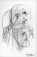
hmmm - I'm considering your comment. To me, it looks garish and tarty, but it makes me laugh, so I think I do like it. She might almost be about to put a headscarf on. But you might be right (you usually are....). I usually need to wait a while before I know whether or not I like something, or even before I can criticise something properly. I do appreciate your comment, Dai - I'll keep on looking and let you know when I understand a bit more.
lol - yes it has humour - strange disembodied baby like head! with odd fried egg eyes - surreal ohhh yes, and yr usual tantalising dislocations of distance in various spaces between trees - keep that up, it's distinctive. Garish also because it has that high green and high red look all over,the two colours would work better if you used a few diff tones of these colours.
These two complimentaries - like the others yell/violet - orange/blue - can be used in that way of course - but they can also be special little cannons.
The trick to make them flicker is to make what is normally the darker colour that lil bit lighter than the other n vice versa - more easily done to the right degree with red and blue funnily enough - but experiment with hot and cold and mixed complimentary pairs - to see what flickers most for you. If you stare at a colour you might have noticed when y close yr eyes -you can still see the shape - but it will be in the the complimentary of what you had been staring at. These are phosphenes - ( a technical retinal name too)- you get them when you rub yr eyes etc. I've spent time trying to mix that odd glowy character of phosphenes, but it depends what col ground y put them on and the colours next to them. I didn't follow it up much. Dali said - when asked what he would do if he was ever in solitary confinment for a long time and he said ' Dali create phosphenes!'
Post a Comment