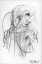
DAI HARDING, visionary artist - long term partner of Gaynor, father of Sam
10.01.1950 - 25.02.2010
'It's always now'- DAI
Your art and your teaching live on....
The title of this blog arose from a piece of writing by Dai Harding. Dai has kindly agreed to be my teacher so this is a space for exercises, drawings and pictures.
 Heyla Dai - I don't know why you couldn't sign in. I checked before and your name and email address were still there. I'll have another look. I painted this while away - it's the next one in the Change series. Unfortunately it's painted in watercolour on poor quality canvas (was all I could find in the local shop) but I'll varnish it when I get the chance - that should help, shouldn't it?
 Heyla, Dai. I've just been looking at your two new Escarpment paintings - oh what glorious colours. And then I look at 'Heart' that I painted before I went to Germany but needed to live with for a while before I put it up. It's dark, it's dark - so I didn't like it at first but I do now because it's right as it is, it has to be dark. I've put it on the Aja site. It's part of the Change series.
 And now for something different. I started this a few months ago and then left it until yesterday. It's been an exploration (sort of in conjunction with drawing practice) of perspective and directions - up and down, in and out etc. It's painted in acrylic on water colour board 50 x 40. It's got lots of imperfections but I like it.
 After I'd finished her (and I never meant to paint her in the first place) she didn't seem to belong with the Hidden Women so I've put her with the Red Men in the Red Series. I don't know whether I'll like her next week or next month, but at the moment she's quite satisfying to look at.
 This is the sketch I told you about that I did with Tescos ballpoint and gel pens. It was interesting to draw without being able to rub anything out. (I like rubbing out so much, I have been known to draw with the rubber as well as with the pencil so this felt like a strange exercise.) It was drawn from memory not a photograph.
